


Plot features
Plot features
You can look at the plot in real time as well as post ride. The basic setup is similar but the available controls are different as panning and zooming the real time version is not a good idea from the safety point of view and screen space of the real-time version is very limited.
The plot occupies the same space as the map or the workout controls on the real time screen. You can switch between them with from the context menu which you can bring up with a long press on the workout controls or plot or a double press on the map. If you want to easily switch between map, plot and workout one option would be to configure different screens with each and then just swipe between them.
Overview
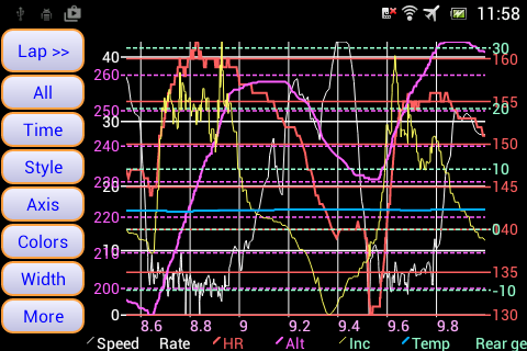
The plot system basically gives you a single plot for the ride with the stats you select visible. Time or distance can be used and switched between for the x axis. There are 4 independent y axis to which you assign the items you want to plot. Items are displayed using the default units you have selected from Settings ->Units control. The y axis will automatically scale itself based on the data to be shown so you want to assign values with similar ranges to the same axis to get a sensible looking plot. As well as assigning an item to an axis you can also adjust the colour used and the line width. Along with the text size for the labels this plot setup represents a 'style' you can have multiple styles and switch between them fairly simply. So you may have different styles setup for showing different information from different sensors or when doing different activities.
Having assigned the axis you have selected which items will be available to plot but you can still enable and disable the displaying of the items just by touching the item on the legend. Theoretically you could assign all the items to an axis but this will make the plot far too cluttered if everything was enabled and with the legend just being a single line there will be far to many items to be able to sensibly select them. My feeling as that a max of about 8 items assigned to axis is the limit but then I would typically just enable 4 or 5 of them at a time. For the real time plot where the width is typically even more limited a max of 5 or 6 items may be it if you want to be able to enable and disable as you ride.
The other thing to be aware of is the the data is drawn axis 0 first up to axis 3 so generally it's best to have data that goes up and down a lot like cadence and power possibly on the lower number axis and then less up and down stuff like Wbalance on the higher axis so it shows up more clearly over the other data. Adjusting the line widths also can help with the visibility. The legend will be in the drawing order from left to right.
Items
Which items you will have data for will depend on what sensors you have. Here is the list basically it's everything IpBike gathers second by second stats on plus some simple calculated items by combining these stats. If you have ideas for other combined simple combined items then let me know. The major thing that is missing is anything related to heart rate variance which is essentially at a higher and variable rate and thus not easy to deal with in the same way as everything else.
- Speed
- Cadence
- Heart Rate
- Power
- Altitude
- Climb rate
- Incline
- Temperature
- Wbalance
- Air speed
- Wind speed
- Haemoglobin concentration
- Saturated haemoglobin percentage
- Power balance
- Left torque effectiveness
- Right torque effectiveness
- Combined pedal smoothness
- Left pedal smoothness
- Right pedal smoothness
- Fork damping
- Shock damping
- Rear gear
- Front gear
- Combined gear
- Battery percentage
- Signal strength
- Threat count
- Threat distance
- Threat speed
The other option that goes into the style is the Plot resolution scale. This essentially sets the amount of data and resolution of the data that the plot system will display on the screen. It is configured as a percentage where 100 represents one second of data per pixel across the plot. The default is 50 so 1 seconds data across every 2 pixels. As you zoom out of the data at this maximum 1 second resolution then lower resolution versions of the data will be used e.g. 2 second resolution then 4, 8, 16 etc. These lower resolutions use an average of the underlying data.
The colouring of the axis labels and grid is based on the items that are assigned to the axis being a combination of the ones currently enabled. Different colours will merge in different ways so you may want to pay attention to then when choosing colours and assigning them to axis.
Real time details
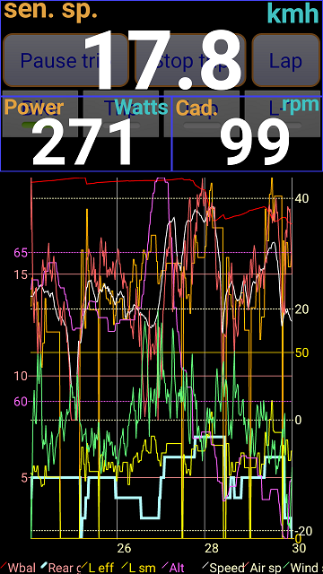
The real time plot is configured from the menu you get by long pressing on it. There are options for configuring the display as well as selecting how much data to display.
Toggle time/distance axis switches between having the x axis based on distance or time.
Style is used to switch styles or create a new style by copying the current one.
Axis takes you to the setting page to select which items are on which axis.
Colour takes you to the setting page for selecting the colour to use for each item.
Width takes you to the settings page for selecting the line width used for each item.
What you get for selecting the the data to display will change based on how much data there is and what you are currently looking at.
All or Windowed select if your looking at all of the data for the ride or just a window on the last part of the data. In windowed mode you will potentially also have More and Less options which increase and decrease the timeframe of the data you are looking at.
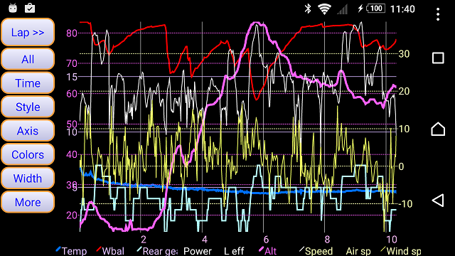
Post ride plot details
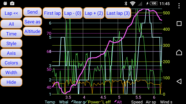
The post ride plot is reached by pressing the plot button when looking at a ride. The plot display always uses a landscape view to make the most of the available screen space. You get a set of buttons on the left for configuring things.
Lap >> expands the to give you the lap selection control buttons which overlay over the plot and let you select a specific lap. You can select First lap, Lap -, Lap + and Last lap to move between the laps. Lap << will hide the lap selection buttons again.
All zooms back out to show all the data.
Distance / Time selects what the x axis is configured to.
Style is used to switch styles or create a new style by copying the current one.
Axis takes you to the setting page to select which items are on which axis.
Colour takes you to the setting page for selecting the colour to use for each item.
Width takes you to the settings page for selecting the line width used for each item.
More displays an extra row of controls Hide will remove them.
Send and Save as will save a version of the plot as you have it configured to a file and either save it to a selected place or send it to any app that will accept an image e.g. you could select a plot showing the details of the big hill you just did and send it to Facebook. The size of the saved image is set by Settings -> Other phone settings -> Plot save options.
Altitude allows you to apply an altitude correction to the altitude data. This is here because on the plot is the easiest place to see that the altitude data may be off. E.g. if you know the minimum or maximum sort of height you went to then you can easily see it as wrong. If you get consistent issues then check the altitude help page for details on how the calibration works. You get two options you can either do a Manual calibration where you specify an amount that will be added to or subtracted from all the altitude data. Online will do an online lookup to get the altitude of your start and end point and then scale everything else in between by this. This can be useful if there was a significant weather shift during the ride changing the pressure and thus leading to the altitude slowly shifting off during the ride.
Touch controls.
A single finger touch and drag allows you to pan the data left and right dragging up will zoom in and down will zoom out.
A double finger touch on capable phones can be use to zoom in and out.
When zoomed in a lot it can be tricky to get exactly the data you want on the plot. To help with this you can actually tap on the plot in the corners to add or remove a single points worth of data. Tapping at the bottom corner removes data from the start or end of the data tapping on the top adds data.