


New customizable display
The customisable display system lets you have multiple different screen setups configured as you want them. By default you will get 3 or 4 different styles of screen that you can swipe between. The default settings are really designed for mounting the phone on the bars. If you are not actively using it as a visible bike computer you probably want to swipe down and un-check Overlay Controls and main sensor display.
|
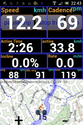
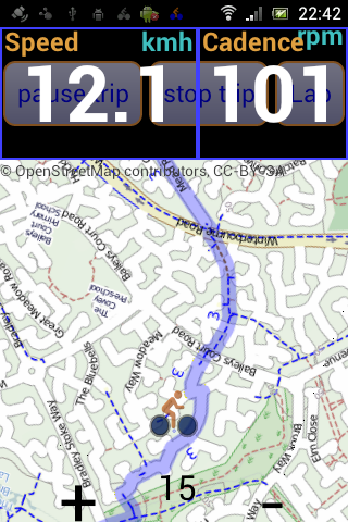
A main sensor readout area is overlaid onto the main start stop buttons which can be pressed whether on top of or below the sensor readout. Under this there are 3 group lines in this case showing active time and speed, incline and rate of climb and Average recent and max cadence. What you get to see by default depends upon your phone and what sensors you have. If you don't have the necessary sensors active then the relevant fields will automatically not be displayed once you start riding. The default setup depends if your phone looks to be ANT capable and whether it has a pressure sensor. The ANT related fields are only in the default screen setups on an ANT capable system. The Incline and climb rate information is more prominent with a pressure sensor based phone as with gps only setups this information although available is of low quality due to gps altitude inaccuracy's. Below the group lines we have the remaining space taken by the Map, Plot or workout controls. I this case the map is showing. |
 The main mixed display is similar to the old style single screen setup.
 |
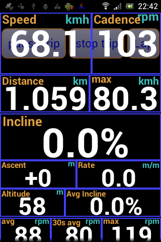
Swiping left we get another screen option. In this case we again have the sensor data overlaying the main control buttons again. Below we just have 3 groups of more data in differing text sizes to help make things more clearly visible. The second group of altitude information has been expanded out to show all thee lines although it can also be contracted down to a single line with just the big incline readout. The same can be done for the other groups so you can have the same basic screen setup but easily modify it while riding e.g. displaying more climbing information when climbing. This screen has no space set aside for the map or plot or workout controls. |
|
Again we have the main buttons and the main sensor readings overlaid into the same space. All the rest of the space is available for the Map (or plot or workout controls) This is the sort of screen you probably want if you are having to seriously use the map to navigate. If you know your way and just want the map as a reference then the mixed screen with more information and a smaller map may be more suitable. If the map is of no interest then the no map style with larger text and more information may be better. These three styles are really just examples you can customise the display to your own liking and have as many screen setups as you want. Swipe down for the main controls for configuring the display buttons and automatic main sensor area as well as positioning and naming the screen. Long press on an item to get the menu for adding groups lines and items and change what is displayed where. Check out the Customising the display page for more details. |
 Another swipe left and you get the third screen.